Our branding

Here are the logo variations and guidelines you’ll need to promote your music on Amazon Music.
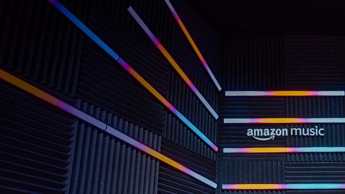
EN_101223_Website2.0_AM4A_Brand-GuidelinesP1_1920x1080_Desktop_v2.jpg
EN_101223_Website2.0_AM4A_Brand-GuidelinesP1_1080x1080_Mobile_v2.jpg

Here are the logo variations and guidelines you’ll need to promote your music on Amazon Music.

URL copied! Logo variations

The horizontal logo is our primary logo and should be used wherever possible. The stacked logo is a variation only used in square placements or where there is not enough horizontal room for the primary logo to remain legible. Use sparingly, only when necessary.

Download logos here

Primary: Horizontal
Primary_H.jpg
White or light background: Horizontal
Light_H.jpg
Cyan background: Horizontal
Cyan_H.jpg
Dark background: Horizontal
Dark_H.jpg
Primary: Stacked
Primary_S.jpg
White or light background: Stacked
Light_S.jpg
Cyan background: Stacked
Cyan_S.jpg
Dark background: Stacked
Dark_S.jpg
URL copied! Logo usage
Clear space
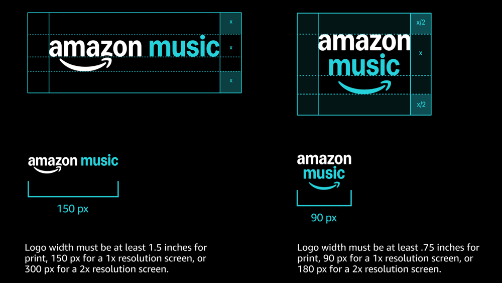
Find the clear space to leave around the logo by using the x height of ‘music’. To keep our logos looking their best, we always stick to these minimum sizes.
EN_101223_Website2.0_AM4A_Brand-GuidelinesP1_1920x1080_Usage_v2.png
Logo positioning
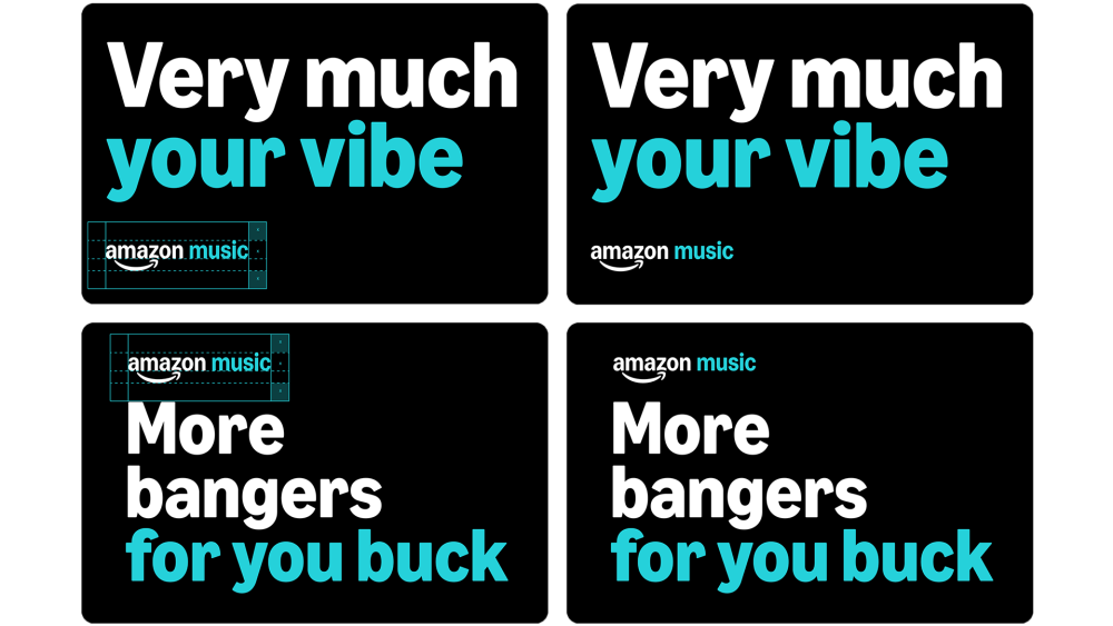
When our logo is locked up with text, we use clear space to let it breathe. When it is positioned on the margin, the clear space lets our logo sit on the edge of assets without getting lost.
EN_101223_Website2.0_AM4A_Brand-GuidelinesP1_1920x1080_Positioning_v2.png
URL copied! Incorrect usage
    Do not distort the logo

    EN_101223_Website2.0_AM4A_Brand-GuidelinesP1_1080x1080_Incorrect_Scale_v2.png
    Do not use the logo in a sentence
    EN_101223_Website2.0_AM4A_Brand-GuidelinesP1_1080x1080_Incorrect_Sentence_v2.png
    Do not alter alignment in the stacked version of the logo
    EN_101223_Website2.0_AM4A_Brand-GuidelinesP1_1080x1080_Incorrect_Spacing_v2.png